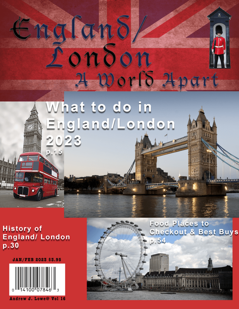
“England/London A World Apart”
With a English family history background I’ve traveled to England many times. I chose to design a magazine layout of “England/London a World Apart.” I then remembered my experiences using Adobe Photoshop. After researching the Interent and collecting images and experimenting with different typeface, arrangement of the images with font sizes, and then the best placement. The next challenge was the best background and color that worked. I finally decided on my images of: Big Ben, Tower Bridge, and the London Eye. Next I decided to use Old English typefaces using Arial Bold with Drop Shadow, and overlaping the images to draw the readers attention. The cover was brought together by the background of the red, blue and white Union Jack background. The final touch of the magazine was the Bearskin Foot Guard tall hat at the top right hand corner.
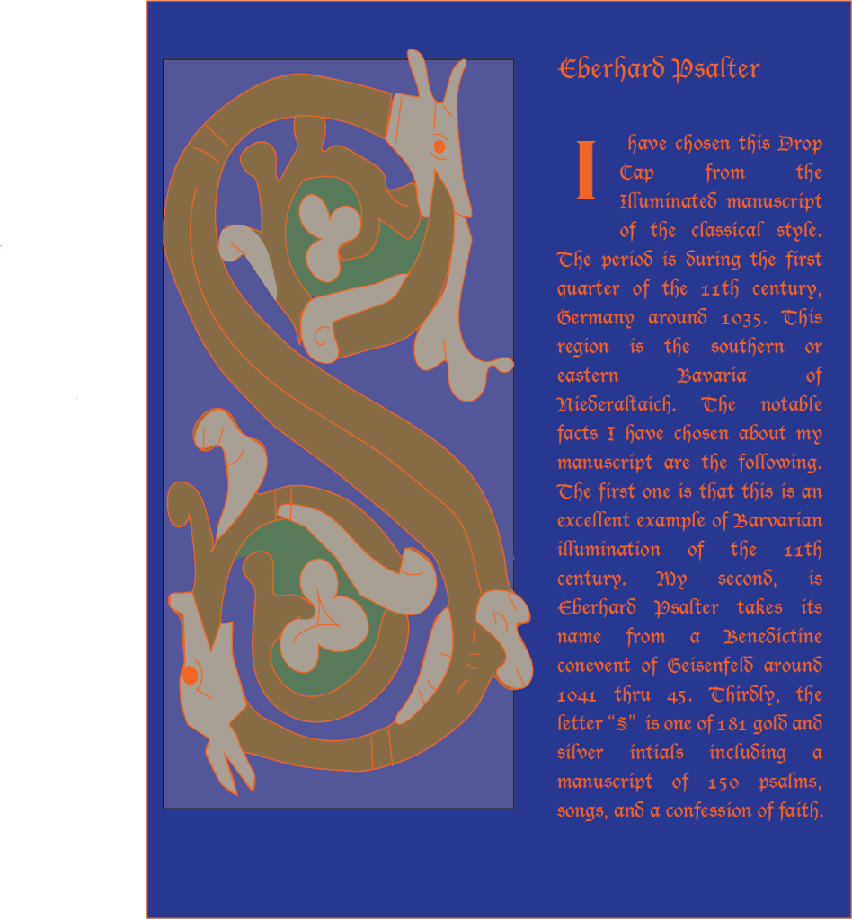
“S” Eberhand Psalter”
My next image is from my Typography class using the Illuminated Manuel Script Drop Cap with Old English font. It is also using the 11th Century Typegraphy Medieval known as the “I” script period. This time period in Germany is the Eleventh Century. The long “S” is a dragon of Eberhand Psalter Manuelscript 150 psalms. The large “ S” was a real challenge due to many flowing lines and decorations along the way from top to the bottom in the letter “S”. The pen tool to draw out all shapes of “S” of the dragon and for clean lines. The shape tool for different shapes of colors to make the dragon be more 2D.
“ Travel Website For England”
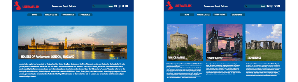
Deciding on four images of interest about England was the first challenage. I reseached the Interent and my own experiences visiting England. I chose Houses of Parliament, Windsor Castle, Tower Bridge and Stonehenge. The next challenge was sizes of images with Houses of Parliament being the largest and my the first one at the web site. Page two had the other three for a total of four pictures with description to click on the website. The top two lines displayed the blue and red with the white contrast of why you want to visit the U.K. My font used was AbaiMT Condensed Extra Bold. Also on the top right is additional search choices to investigate. A standard light blue is used for both pages to unite the web site.
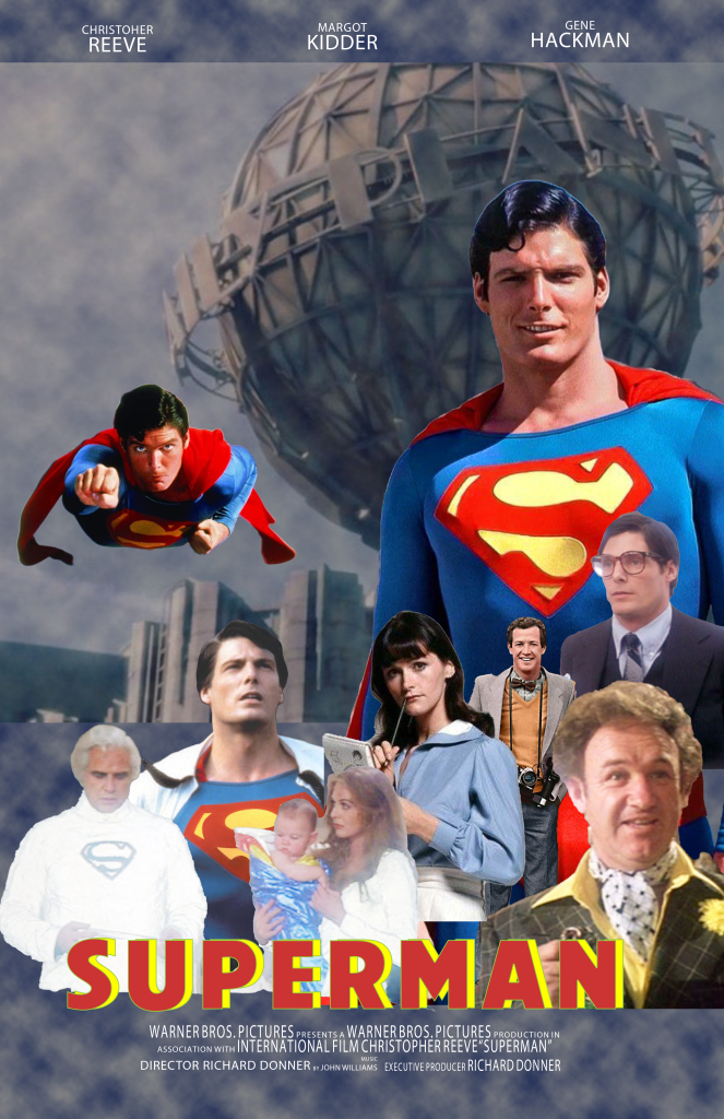
“Superman”
I decided to design a movie poster about Superman because of my interst in the past with Super Heroes I watched, as young boy growing up. My favorite Superman was Christopher Reeve. In the Photoshop for Designers class, I used Adobe Photoshop Compostion where I learned about layers and techinques, filters layers, adjustments, Up,up and away font of the title Superman. I also became aware of object Selection using different effects of quick selection tools. For a filter I used different clouds. After researching the the Interent I found many images of Christopher Reeve’s Superman. With these images of different sizes I tried a collage in different arrangements. The top of the web site are three choices to click on. The final arrangement I decided on was the one you see at the web site. Layout at the bottom of the viewing area are many charactors and builds in a pyramid form and reaching to a focus of Christopher Reeve and others charactors in front of a globe of the “Daily Planet”. The base of the poster in is a larger font the name of Superman in yellow which balances out with the upper right side with the same colors of a large “S”.
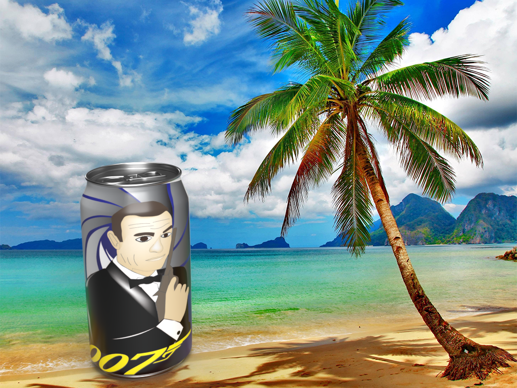
“ James Bond Logo”
The next project was fun in choosing 007 James Bond. Sean Connery being my favorite James Bond was the easy part and then I had to brainstorm the soda can side view of James Bond. After a little research and investigation many ideas I finally came up with putting the classic pose of James Bond around a can. The James Bond was done in the Adobe Illusrtrator class as a logo using the shape tool and pen tool. With a gradient tool I made it come out as 2D. That idea proved a challege of research about how to wrap the image of James Bond around a can. The next challenge was the background scene or location. After additional research I thought about past movie locations which lead to the Caribbean Sea where many James Bond movies were located for action where I put a Palm Tree.
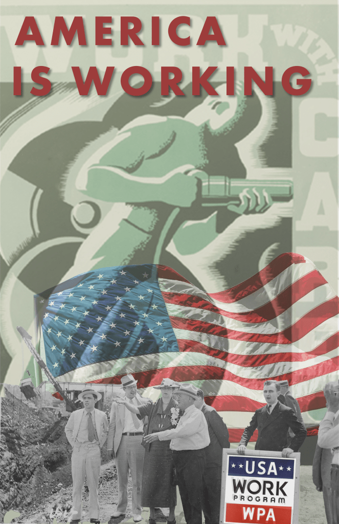
“America is Working”
The first challenge I faced with this project was educating myself about what is the WPA. Next, I learned it had its beginning during the new Deal of President Roosevelt to end the Great Depression as a federal relief program like the Public workers of the Art Project. This includes the visual Artists traveling art shows which ended in 1943. The black and white images were found to bring money into finding government programs of young artists. This also landed the careers of many photo journalists. Next, after research, I looked at numerous photographs during this period of classic black white stylized images such as the gray background steelworker using an electric hammer centered in my poster. The theme were people of all backgrounds united together in WPA work programs with jobs and worked themselves out of proverty to be a successful wage earners with skills by being productive. I used the Object Selection tool to cut out all of the images to blend them together. The poster is blending techniques and layered adjustments. My goal was to make a poster using the ideas & subject matter workers with the American government.
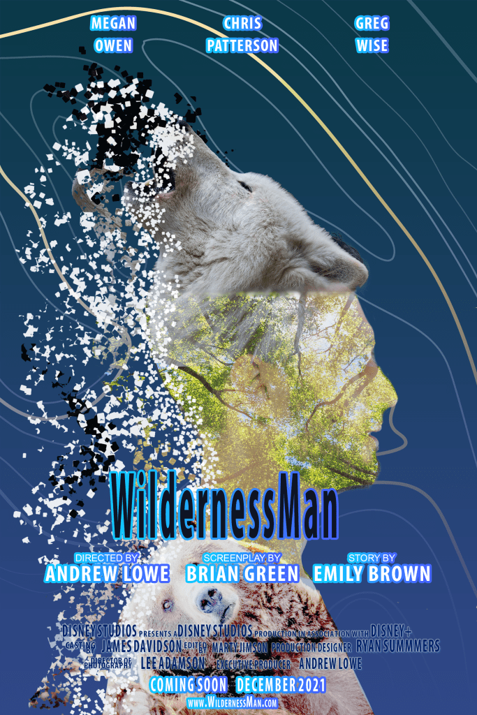
“Wilderness Man”
My goal was to create a movie poster of a Man part Wolf and part Bear. Particle Displacement was center to left blending from the Wolf Man head scattering into little paricles. The three images were of double exposure. I spent a great deal of time with this area to get the best special effects. Also, of challenge, was location of the Wolf head placement pointing upward for the side view human. Another challenge was background of the light blue and the flowing lines circling around the human figure and Wolf which finally flowed around like waves of water. The final challenge was the names of three characters across the top in white, “Wilderness Man” in black blue center letters followed by movie credits below in smaller lettering with blue highlights. I had to try different font sizes & colors for best viewer understanding.
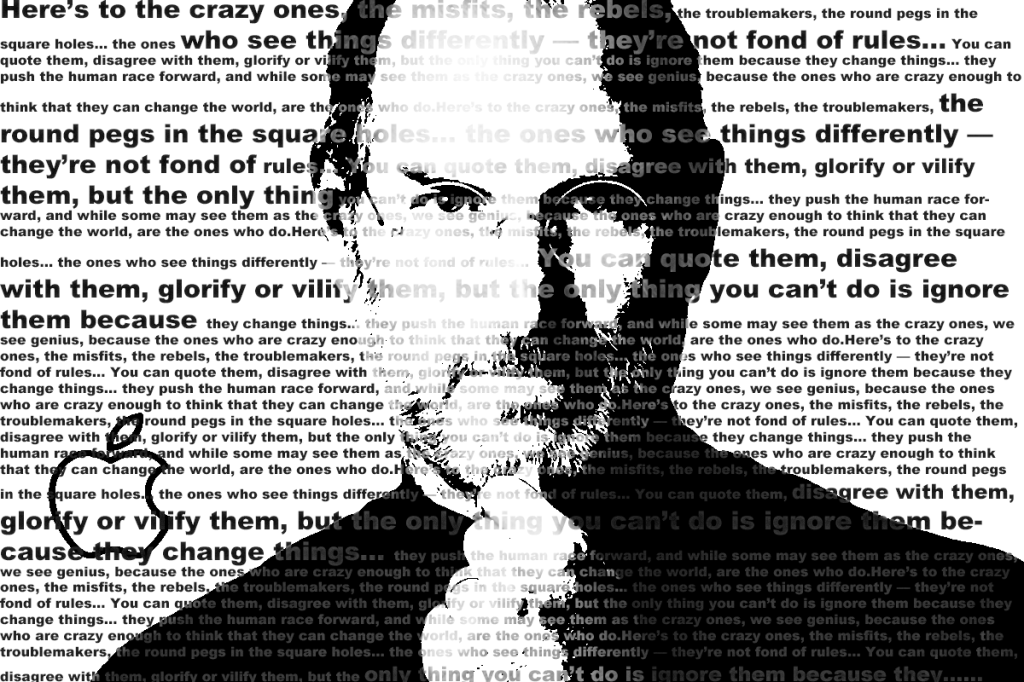
“Steve Jobs Think Different Campaign”
I’m an Apple fan with Apple products. I chose the founder of Apple which is why I choose Steve Jobs. With my Photoshop for Designers class I used the Adobe Photoshop using Steve Jobs “Think Different campagin to the crazy ones, misfits, trouble makers” round page round whole…” I placed the Steve Jobs image in front center and the overlay words for the Steve Jobs image in contrasting blacks, and grays in varing shades so that you can read the message. The real challenge was getting the best tones of blacks and grays. It was also a challenge getting the image of Steve Jobs and writing to an acceptable contrast to read and understand the over all message.
